Showing posts with label Unique. Show all posts

27.3.20

FoNtS

HeLlO! I hAvE a QuEsTiOn...

What made you click on this blog post over all the rest? Did the title stand out against the rest? Keep this in mind as you read the rest of this post...

As I have already demonstrated, every part of my film opening is a conscious decision that is meant to set the tone or achieve the purpose of my production. One conscious decision I made during the development process of my opening is the use of a specific font.

Fonts are an incredibly important yet widely overlooked portion of a film. Most films that are streamed will lose their viewers within the first 15 seconds of its playing (Film Shortage, 2010, p.1). This demonstrates how crucial the opening of a film is to the overall production. An effective font can serve to grab the attention of the viewer, which is an important part of a film opening.

Not only should the font grab the attention of the viewer, but it also should set the tone of the production. Take a look at these film titles. Pay close attention to the font that is used.
In some film titles, the font serves to establish the setting of the film. In the case of Once Upon a Time in Hollywood, the font mimics the font of the world-famous Hollywood Sign in California. Pretend the title was written in this font. How would the viewer know which Hollywood the film is taking place in? Hollywood, Florida? Hollywood, Georgia? This specific font tells the viewer that the film will be set in Hollywood, California.
In other film titles, the font serves to establish the tone of the film. For example, if the film title "SE7EN" was written in this font, it would tell the viewer nothing about the production. However, because it is written in a faded, bold, two-toned font, it is effective in setting the tone of the film as ominous, dark, and scary.


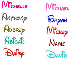
However, according to Film Shortage, there are some fonts you should never use for your production. Not only does this include common fonts like Times New Roman and Arial, but it also includes fonts that are iconic of other productions or brands. For example, Disney is a brand that uses a very iconic font for all aspects of its corporation. When a consumer sees the Disney font, they immediately think of Disney. Take a look at this photo:


Even though those words don't say "Disney" chances are that you associated them with Disney due to them being in Disney's signature font. For these reasons, it is important I stay away from fonts that are iconic of other brands, businesses, or productions.

With these concepts in mind, I will search for a new font that will better fit my production. Stay tuned to see what I find!


References:

Film Shortage. Typography And Titles in Film. Retrieved from https://filmshortage.com/typography-and-titles-in-film/

May, J. (4 Oct, 2010). Smashing Magazine. The Art Of Film Title Design Throughout Cinema History. Retrieved from https://www.smashingmagazine.com/2010/10/the-art-of-the-film-title-throughout-cinema-history/#top


25.3.20

Second Edit

Hello! Today, I continued to edit my film opening. May I say, it has come together into an incredible opening. I still have some work to do, but it is in pretty good shape right now. Take a look!

Film Opening Second Edit

Music
Before today, I felt that my film opening was too silent. Due to the fact that there is no dialogue in the opening, I had to be careful to make sure that sound elements were used effectively. I used clips from two free, uncopyrighted songs: 100 Seconds and Sorrow in Raindrops. I picked these songs because their dramatic, ominous, and suspenseful tone is effective in setting the tone of the opening and grabbing the user's attention.

I had to get very creative with pairing the music with the visuals. I only wanted some parts of the songs and not others and I wanted certain sounds to be paired with certain moments in the opening. For example, the song 100 seconds is one minute and 40 seconds long (100 seconds... lol) but I only used the first three seconds of it in my opening. The tone of the rest of the song did not match the tone I was going for, but I really liked the first few seconds of it. So, I copied the first three seconds three times, and for each copy I had the volume level decrease. This created a loop where the three repeated audio segments flowed smoothly. I haven't had much experience in sound editing, so I was very impressed by how good it sounded.

Below are the full references for the songs
100 Seconds by Punch Deck | https://soundcloud.com/punch-deck
Music promoted by https://www.free-stock-music.com
Creative Commons Attribution 3.0 Unported License
https://creativecommons.org/licenses/by/3.0/deed.en_US\

Sorrow in Raindrops by Keys of Moon | https://soundcloud.com/keysofmoon
Music promoted by https://www.free-stock-music.com
Attribution 4.0 International (CC BY 4.0)
https://creativecommons.org/licenses/by/4.0/


Within the next few days, I will finalize the film opening. Stay tuned to see how it looks!

19.2.20

Something you've never seen before...

Hello! Today, I decided on an idea that I will create my film opening on!


Mason's Media Studies Studios will create a...

Female Criminal Film


I decided on creating a female criminal film because it was a unique and engaging idea that challenges societal stereotypes.

Here is a rough outline of what the film opening will look like:
  1. Opening
    1. Mason's Media Studies Studios (MMSS) logo
    2. Title- Fade to establishing shot of female in the car outside of a park
    3. Close-up of a boy playing on the playground
  2. Home 
    1. The female drives home and eats dinner alone in a dark house.
    2. Series of shots with pictures of (assumed to be) deceased husband on the wall.
    3. Female prepares basement for child
  3. Park
    1. The female gets out of the car, clearly distressed.
    2. Female walks to the child sitting on a bench.
    3. The child turns and faces the female.
  4. END
I will work on more details this week, so stay tuned!