HeLlO! I hAvE a QuEsTiOn...
What made you click on this blog post over all the rest? Did the title stand out against the rest? Keep this in mind as you read the rest of this post...
As I have already demonstrated, every part of my film opening is a conscious decision that is meant to set the tone or achieve the purpose of my production. One conscious decision I made during the development process of my opening is the use of a specific font.
Fonts are an incredibly important yet widely overlooked portion of a film. Most films that are streamed will lose their viewers within the first 15 seconds of its playing (Film Shortage, 2010, p.1). This demonstrates how crucial the opening of a film is to the overall production. An effective font can serve to grab the attention of the viewer, which is an important part of a film opening.
Not only should the font grab the attention of the viewer, but it also should set the tone of the production. Take a look at these film titles. Pay close attention to the font that is used.
In some film titles, the font serves to establish the setting of the film. In the case of Once Upon a Time in Hollywood, the font mimics the font of the world-famous Hollywood Sign in California. Pretend the title was written in this font. How would the viewer know which Hollywood the film is taking place in? Hollywood, Florida? Hollywood, Georgia? This specific font tells the viewer that the film will be set in Hollywood, California.
In other film titles, the font serves to establish the tone of the film. For example, if the film title "SE7EN" was written in this font, it would tell the viewer nothing about the production. However, because it is written in a faded, bold, two-toned font, it is effective in setting the tone of the film as ominous, dark, and scary.
However, according to
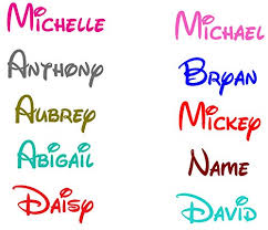
Film Shortage, there are some fonts you should never use for your production. Not only does this include common fonts like Times New Roman and Arial, but it also includes fonts that are iconic of other productions or brands. For example, Disney is a brand that uses a very iconic font for all aspects of its corporation. When a consumer sees the Disney font, they immediately think of Disney. Take a look at this photo:
Even though those words don't say "Disney" chances are that you associated them with Disney due to them being in Disney's signature font. For these reasons, it is important I stay away from fonts that are iconic of other brands, businesses, or productions.
With these concepts in mind, I will search for a new font that will better fit my production. Stay tuned to see what I find!
References:
Film Shortage. Typography And Titles in Film. Retrieved from https://filmshortage.com/typography-and-titles-in-film/
May, J. (4 Oct, 2010). Smashing Magazine. The Art Of Film Title Design Throughout Cinema History. Retrieved from https://www.smashingmagazine.com/2010/10/the-art-of-the-film-title-throughout-cinema-history/#top